Behind the Design: The Set of PHOTOGRAPH 51

In preparation for our upcoming production of Photograph 51, we spoke with scenic designer Arnel Sancianco to learn more about his process, and how he went about designing a stunning set for Anna Ziegler’s play about ambition, science, and Rosalind Franklin.
For Photograph 51, you began with research images, and then transitioned into sketches, a “white model,” some color options, and a scale model. What is the purpose of each of these steps? Was this approach specific to Photograph 51 or just your general approach?
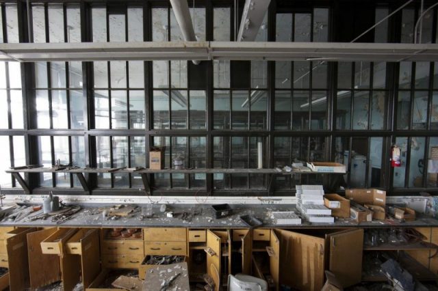
Each one of these steps was a different way I was communicating with our director, Vanessa Stalling. As a designer, it’s hard using just words to describe what I’m envisioning in my head. I need to make sure Vanessa is seeing exactly what I’m seeing, without causing any further confusion. Vanessa originally sent me this image below and I used that as a jumping off point.

How does your research and initial conceptual work aide your conversations with the director and other designers?
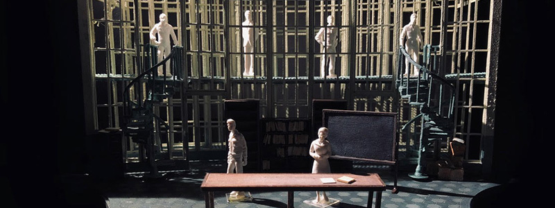
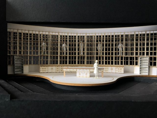
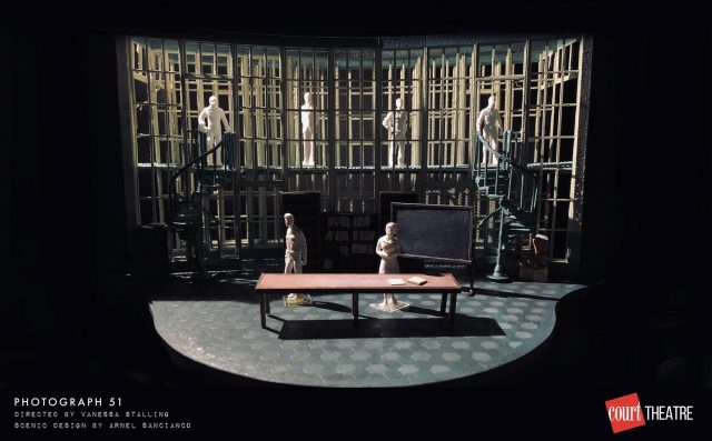
The model, I think, is the most valuable tool set designers have in their arsenal. It’s a near accurate representation of what exists in my head in a tangible, three-dimensional form. The earliest model originally had two rows of windows. It was Keith Parham, the Lighting Designer, who pointed out that if we had one more layer of windows we could really get some mesmerizing depth in the design.
How do you approach a play like Photograph 51? How much input do you receive from the director and other designers?
This is my second Anna Ziegler play that I’ve designed and I really love the fluidity of her writing. Her scenes flow seamlessly into the next and it’s this pacing that builds a momentum that I don’t see in many other playwrights. Knowing this I made sure that my set didn’t get in the way of Ziegler’s writing. We don’t have time for major wall shifts or expensive transitions. Movements like that didn’t feel right with the way play ebbed and flowed. In terms of input from my team, you’ll note how collaborative we’ve been working just to create the physical space for the play. I may be responsible for the set, but we are all working to create a singular experience for the Court audiences. Before we were able to move forward with the final model, Kieth, Paul, Vanessa, and I all agreed that we needed to test out the layering of windows in full scale to see how they would interact with projections.

What was one of your main goals with this set design?
Along with trying to handle projections and creating an all-encompassing space for the story to unfold, I really wanted to create a feeling of observation. There’s a unique feeling that any marginalized person feels when they’re put into a position of power. It’s this exposed feeling that someone is watching your every move, waiting for you to fail so you can be another example of your race or gender’s incompetence. That, I think, is what’s at the very core of Photograph 51. This feeling of pressure that got in the way of Dr. Franklin, and stopped her from seeing what was right in front of her.
You mentioned on Instagram that your initial design proposal was over budget. In what ways did you scale it back, while still maintaining the features from your initial designs that you considered most integral?
The original design was a full panoramic experience that spanned the entire width of the theatre. As we approached the bidding process, we were preparing to scale back, and we kept in our minds a set of “must haves” for the final design. The window idea was one of those “must haves,” along with the upper-level bridge where our chorus of men could perch themselves. As stressful as the cutting process is, I thoroughly enjoy it at the end. It’s an exciting way to challenge your design’s values and point-of-view. Anything that doesn’t support the perspective of the play or the action of the story is deemed unnecessary, and I cut it without regret. The panoramic design was an awesome (and I mean to use this word in the biblical sense) take on this window idea, but the width didn’t really do much more. We discovered as we narrowed the design’s wings that the smaller space allowed for quicker transitions and created a more focused energy to the play. Fun fact: I was in Philadelphia, in rehearsal for another show, when we decided to focus the design down. I grabbed all the scrap board I could find in the prop shop and built a model in my hotel room to show Vanessa what the new design would look like.

Photograph 51 runs January 17 – February 17 → Get Tickets.
4 responses on “Behind the Design: The Set of PHOTOGRAPH 51”
Comments are closed.
Arnel Sancianco you are so talented in creating this panoramic design with your brilliant imagination! ???????????? l wish l could somehow see this show here in SD!
I am glad you intend to do justice to one of the most unfair scientific stories.
There are two very good books written about Rosalind Franklin. .
Rosalind Franklin knew that she was seeing a double helix. She gave a seminar about it. Her boss, Wilkins gave the photo unauthorized to Crick and Watson.
They described her as an embittered spinster which she was not!
I taught a course on women scientists some years ago and as scientist myself am quite familiar with the treatment of female workers in the lab.
Uof C background, PhD, chemistry, 1962, Research scientist at James Franck Institute(retired), still doing research at IIT.
Good luck with the production. I will certainly come to see it.
Dr Susan Meschel
meschel@jfi.uchicago.edu
Great set! The use of the helix-like spiral staircases was brilliant.
Why not comment on the brilliant double ‘helixes’ of the staircases?