Room to explore in ALL MY SONS
John Culbert is the scenic designer for Court Theatre’s upcoming production of Arthur Miller’s All My Sons. Court Theatre intern Emily Lynch spoke with him about the design process, his plans for the production, and the thrill of creating a world onstage.
Tell me about your design for All My Sons.
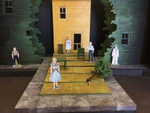
Our effort was to find a design that was not only a literal recreation of the environment described in the script, but also hopefully to capture some of the emotional content of the play. You have a family who is working really hard to uphold this facade of truth and good, and there’s also the town around them. The threat of the neighborhood always is present as the Kellers try to uphold their lie. So we tried to create a world that would make those opposing forces palpable.
Also, we don’t necessarily want all the actors’ behavior to be naturalistic. We wanted room, particularly in extreme moments, for behavior to be extreme. We wanted a world to allude to locations in the script but not duplicate a realistic world on stage.
What was your process like?

The basis for all of it was research. We did literal research, looking at images of wartime factories and backyards, and we also looked at artwork of the period.
There’s an image in the script which we were struggling to figure out—the apple tree. It’s fraught with inconsistencies: they planted this apple tree three years ago in recognition of their son, so it’s literally [holds fingers together] this big around. It wouldn’t have fruit on it, nor would it blow over in a storm. So I looked at images of trees to deepen my understanding of how the tree might be useful to us. We ended up not wanting to magnify the image, because I couldn’t figure out why we would. What does this apple tree do in the script besides serve as symbolism for their son?
We did find out, though, that Arthur Miller had a son in the war who wrote many letters home. There was one letter in which the son wrote about how his unit had camped in an apple orchard, and the trees had fruit on them, but they weren’t allowed to touch any of the fruit. So the conjecture is that there’s an apple tree in this play is because it was meaningful to Arthur Miller.

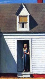
We also looked a lot at Edward Hopper paintings. What we were responding to with these is that they depict real things but in a very abstracted way. And then there’s a lot of negative space and a lot of strong, geometric shapes. We ended up taking those ideas, and ended up with a center wall and with an island of a yard. The world around them is represented by negative shapes, by cutouts of poplar trees.
What is the significance of using Edward Hopper as an inspiration?
His paintings capture a specific feeling of the play. These are classic American scenes that appear to be happy in one way, but if you look closer, you can see that all is not well. We—all of the designers—were captured by this contrast of appearance and reality.
How does your design interact with the other design elements of the show?
Well, I hope they interact completely and totally! The designs tend to be generated at different times, but we’re all involved in the process of building a world, in choosing levels of reality, color palette, all of that.
Do you think there has been a recent shift towards minimalist set designs? If so, what do you think accounts for that?
I don’t know that it’s recent. I think there have been, for decades, different ways that people look at classic plays. And when you’re working on a classic piece, there are a lot of ways into it. The hope is that through different entry points we will yield different insights.
I guess the question is, “How do we get the audience to see themselves in the piece? How do we get them to learn something about themselves?” I don’t mean “learn” in the sense that we’re teaching them something, but that they can have a new insight into human behavior and maybe even their own behavior.
The hope is that when you make a world that is not totally literal, people bring their own experiences to it. They come up with metaphors that they saw in the world that are way richer than anything we dreamt about while we were designing it ourselves. Often in talkbacks audience members will say, “The set made me think of this and this and this. Did you mean that?” And we’re like, “Sure!”
Overall, you’re hoping the play invites the audience to be actively involved. An abstract, less realistic world makes the audience dig deeper.
What initially drew you, and what continues to draw you to scenic design?
I do scenery and lighting design, and I see them both very similarly. I’m excited about the possibility of creating a world, about having that world support a specific story, and about getting the audience to think.
I think live theater is a very important way that our community can gain understanding about itself. It’s a collective experience. We’re surrounded by people we don’t know, and I think that’s both part of why it works and part of why it’s different than other ways we receive stories today.
It’s very important that there’s this communal element to live theater, and being able to create a world that allows that to happen is very exciting.
Image: Edward Hopper, High Noon, 1949